CMD Inc.
A black & white identity built on one mark, the Star Note, with the 3D & motion for its website.
- Client
- CMD Inc.
- Disciplines
- Visual identity, Branding, Motion
- Year
- 2026
The Problem
CMD Inc. is a music company working across film, games, healthcare & music therapy. It was planning a website built around its soundscapes, and needed an identity that looked like its sound, plus 3D & motion pieces for the site.
The brief: a look that moves like spatial audio, with a sci-fi feel and an interface that's easy on the eye.
What I Did
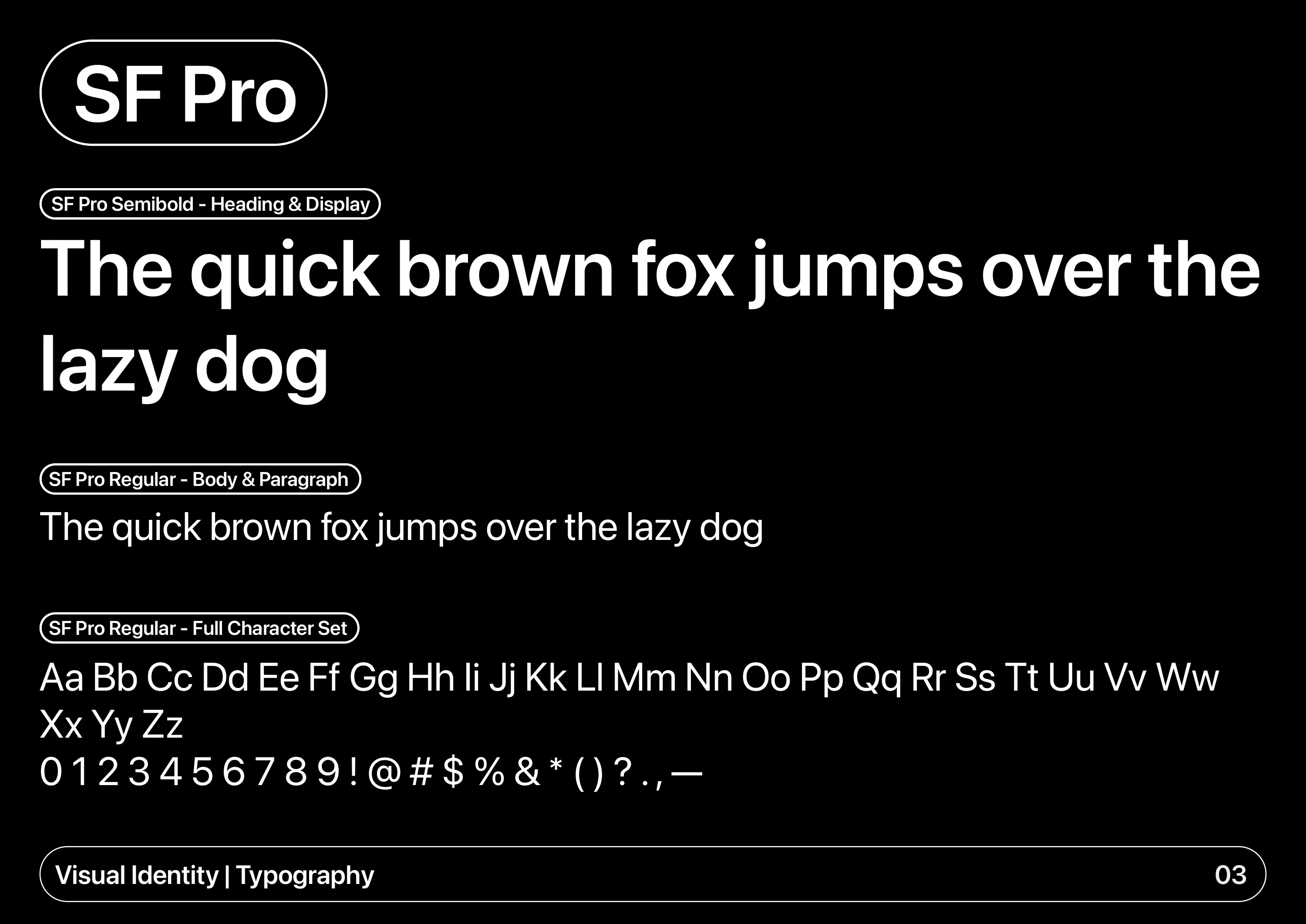
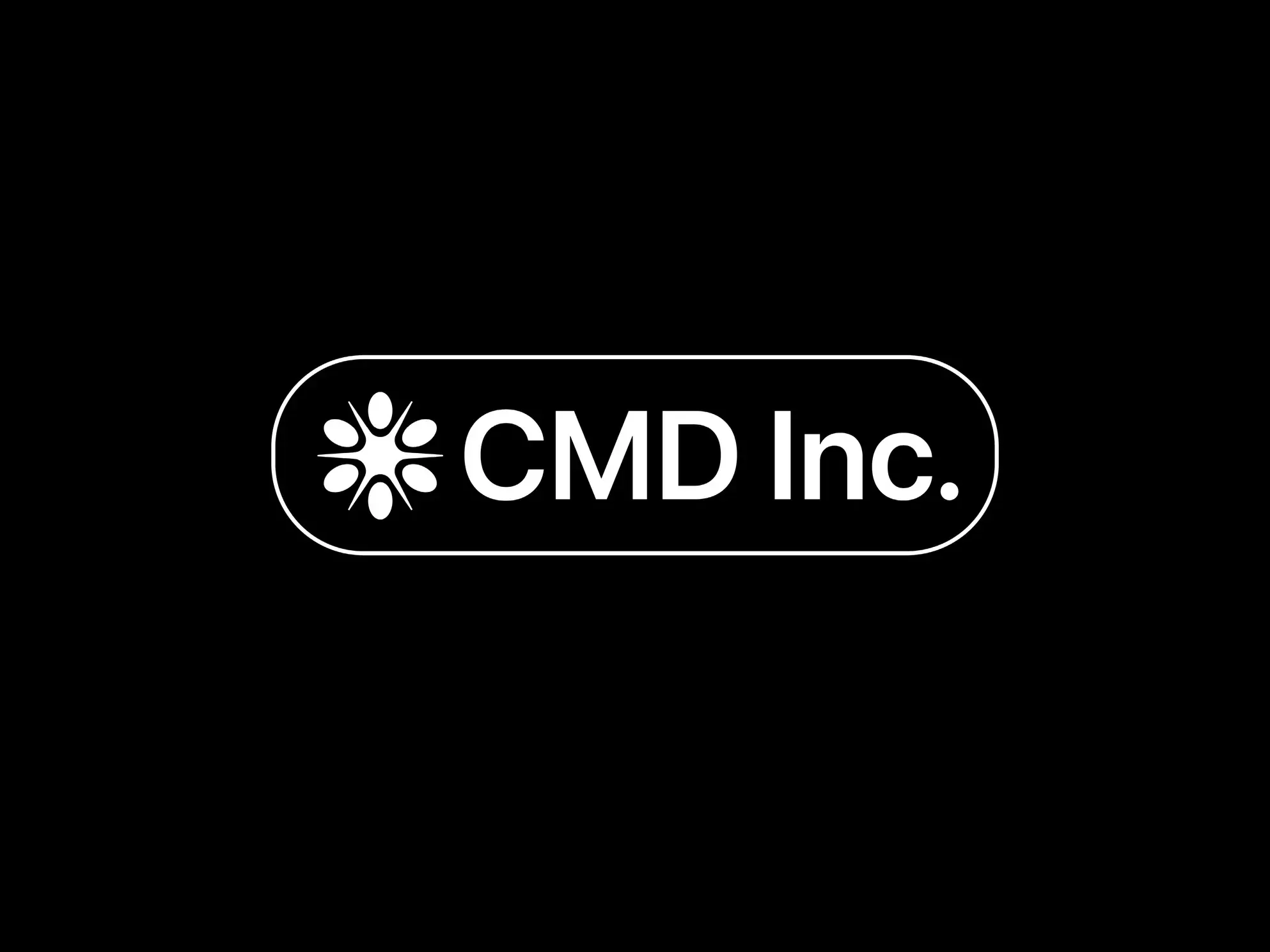
I started with the wordmark. The client's first font was pixelated, so my early versions made the type look like stardust moving with the sound. I dropped it for two reasons: it wasn't a vector, so it wouldn't scale cleanly, and the brand had to be easy to read for neurodivergent people. The final wordmark is set in SF Pro Semibold, inside a rounded outline.
Then came the icon, the Star Note, and every 3D, motion & web file the developer needed. It all went into a visual identity guide and one shared folder.
The Work
The Star Note
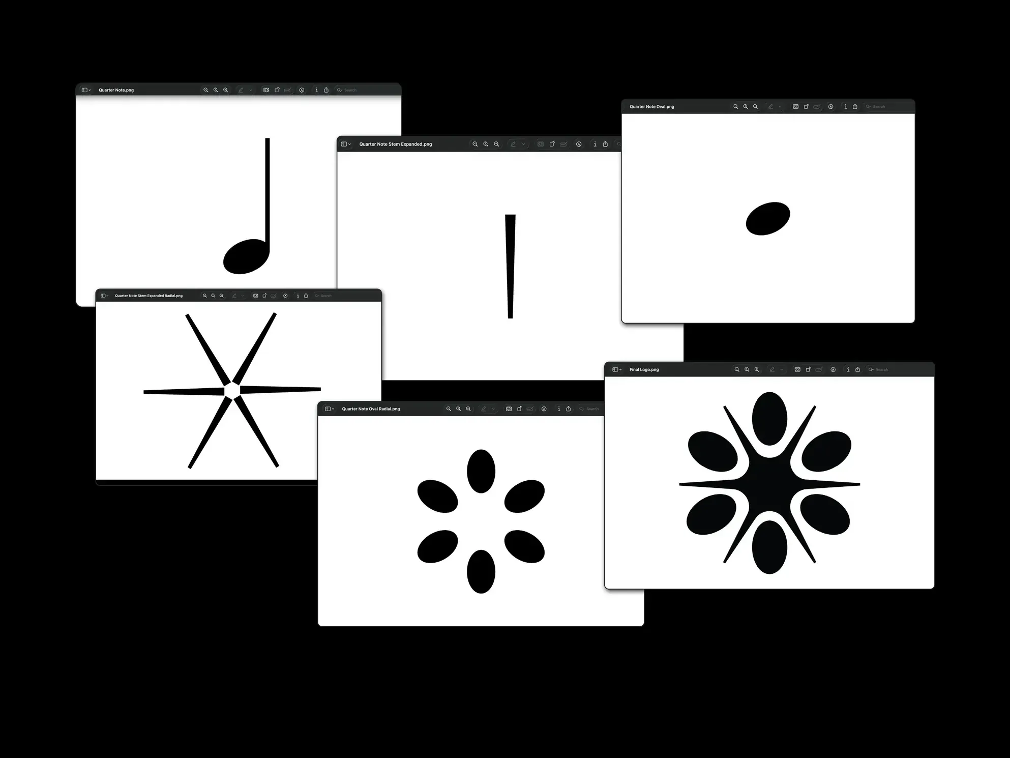
My first mark was based on an Ambisonic microphone, the kind used to record 3D audio. People I showed it to said it looked like a football, not music, so I went to sheet music instead.
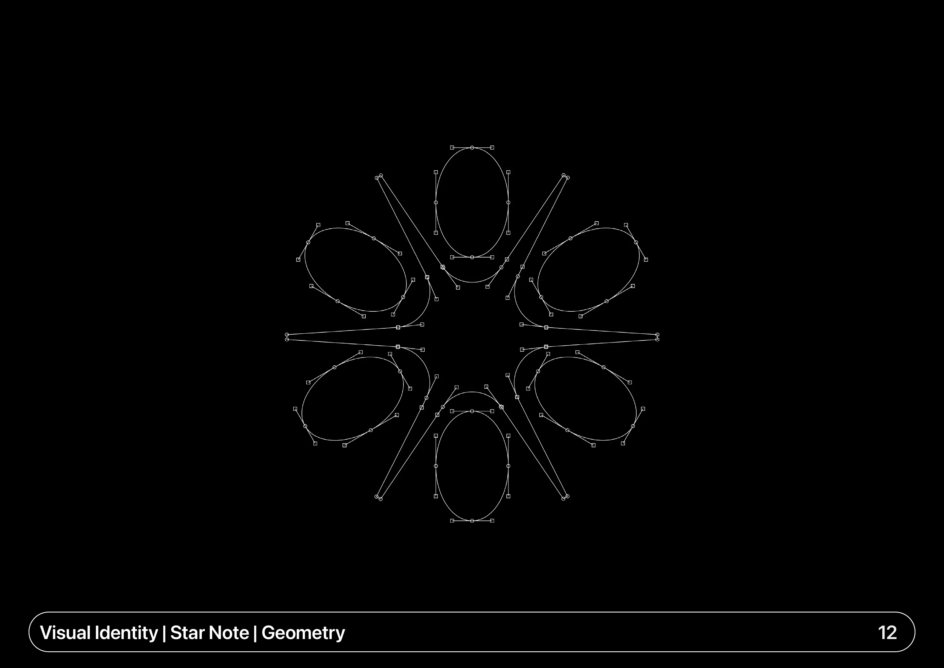
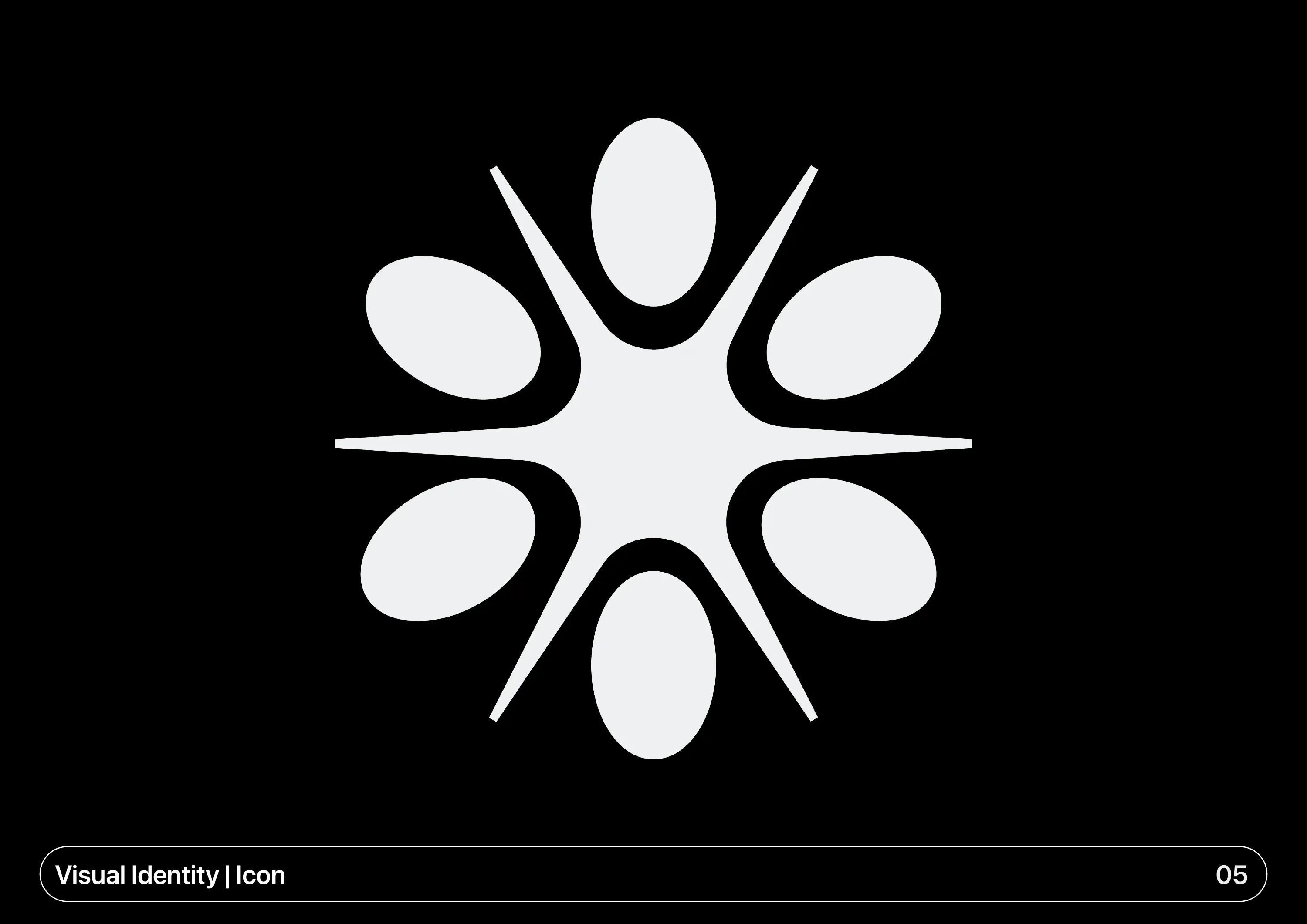
The mark starts with a quarter note. I took it apart: the oval became the building block and the stem became a ray. I made the shapes bold so they stay easy to read for neurodivergent people.
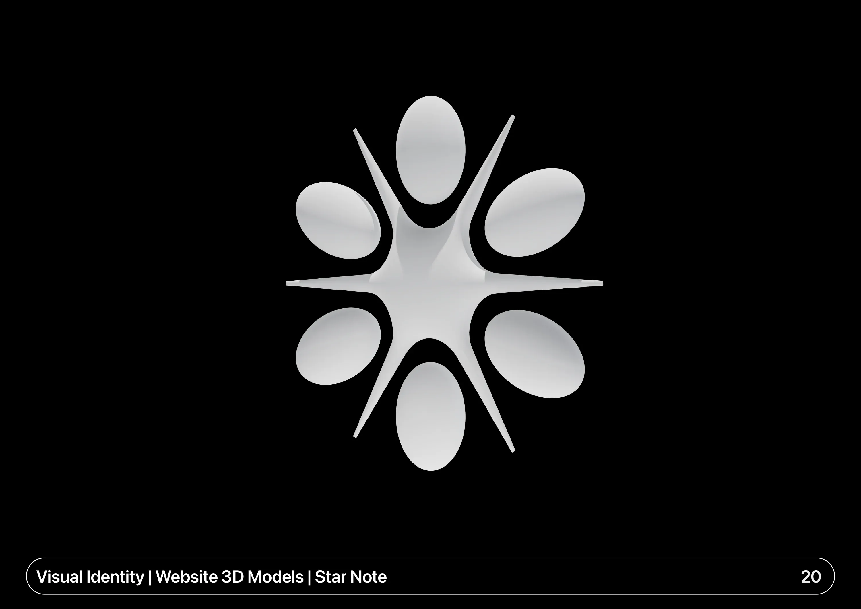
Six ovals now sit around one bright centre, joined by the rays.
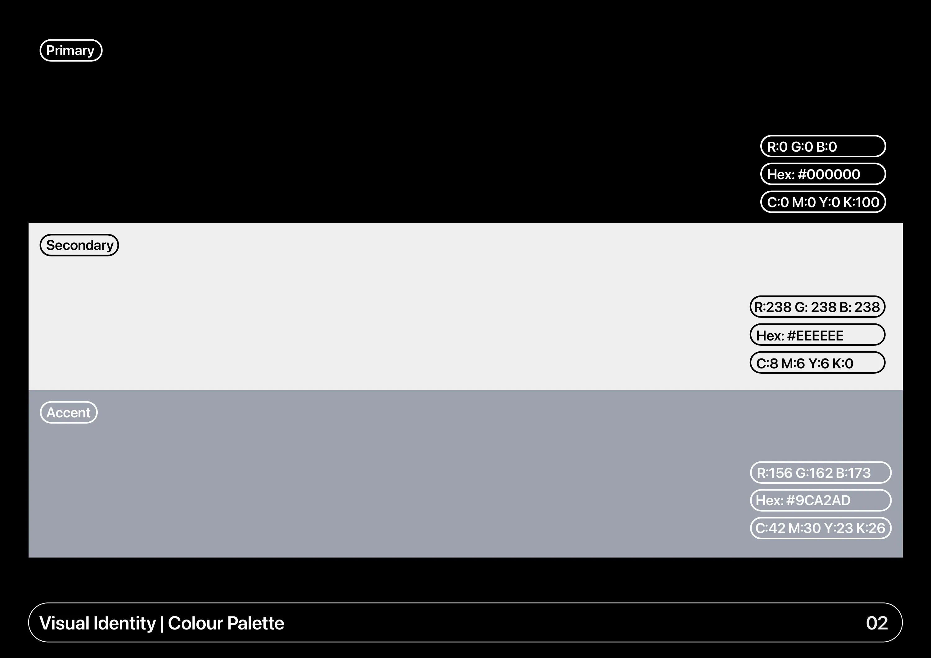
Black, White & One Grey
The colours stay close to the client's reference site: black, an off-white and one cool grey. Headings are SF Pro Semibold and body text is SF Pro Regular.
Sound You Can See
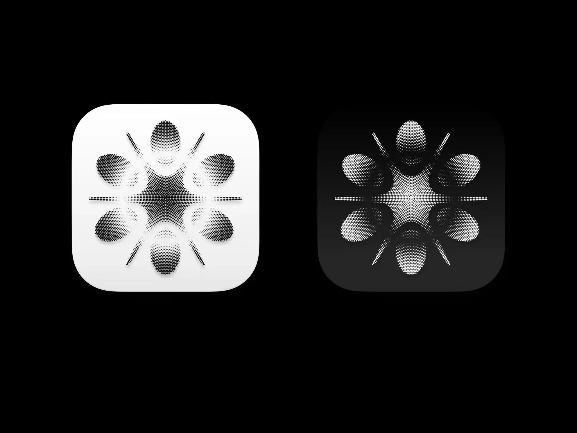
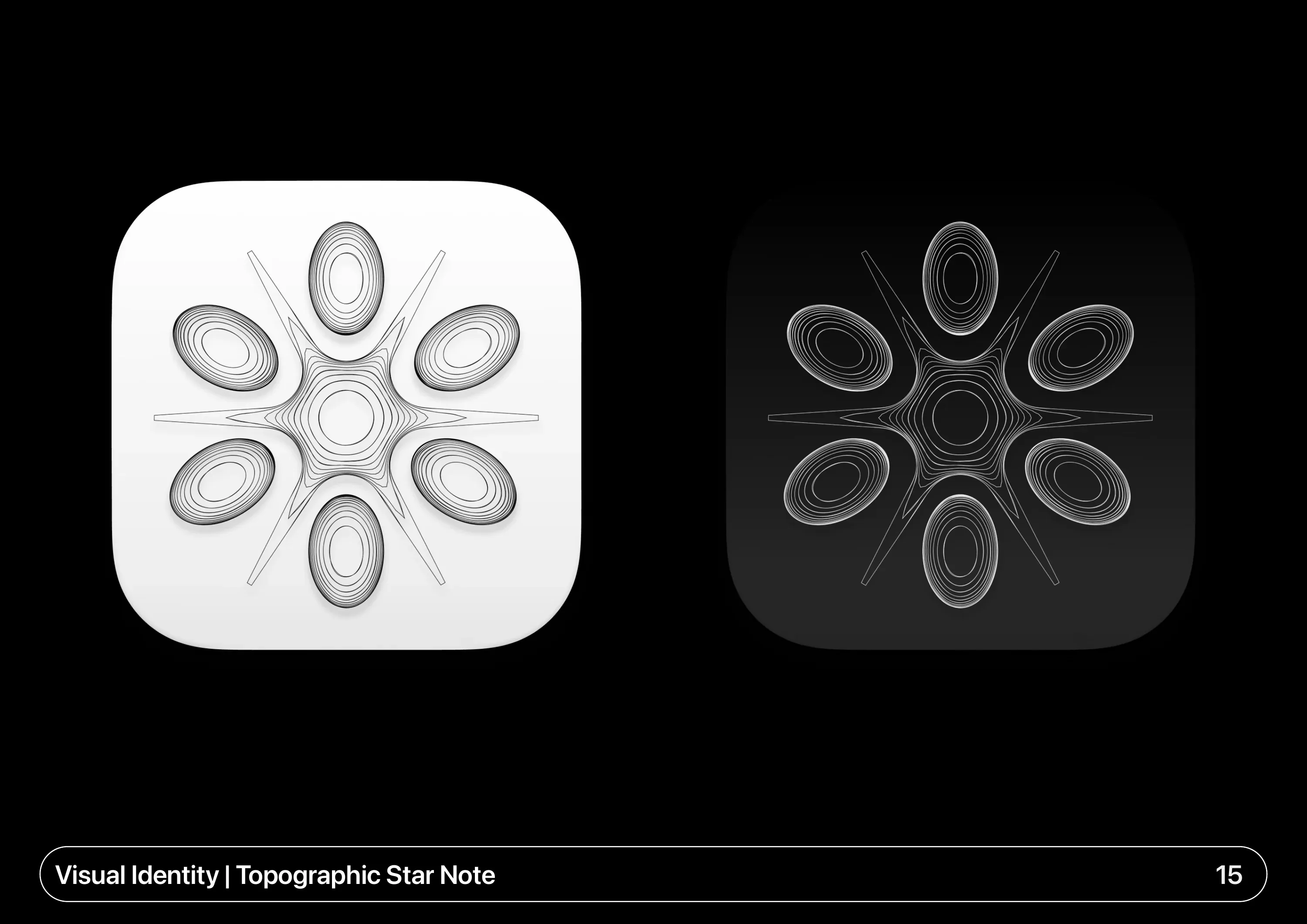
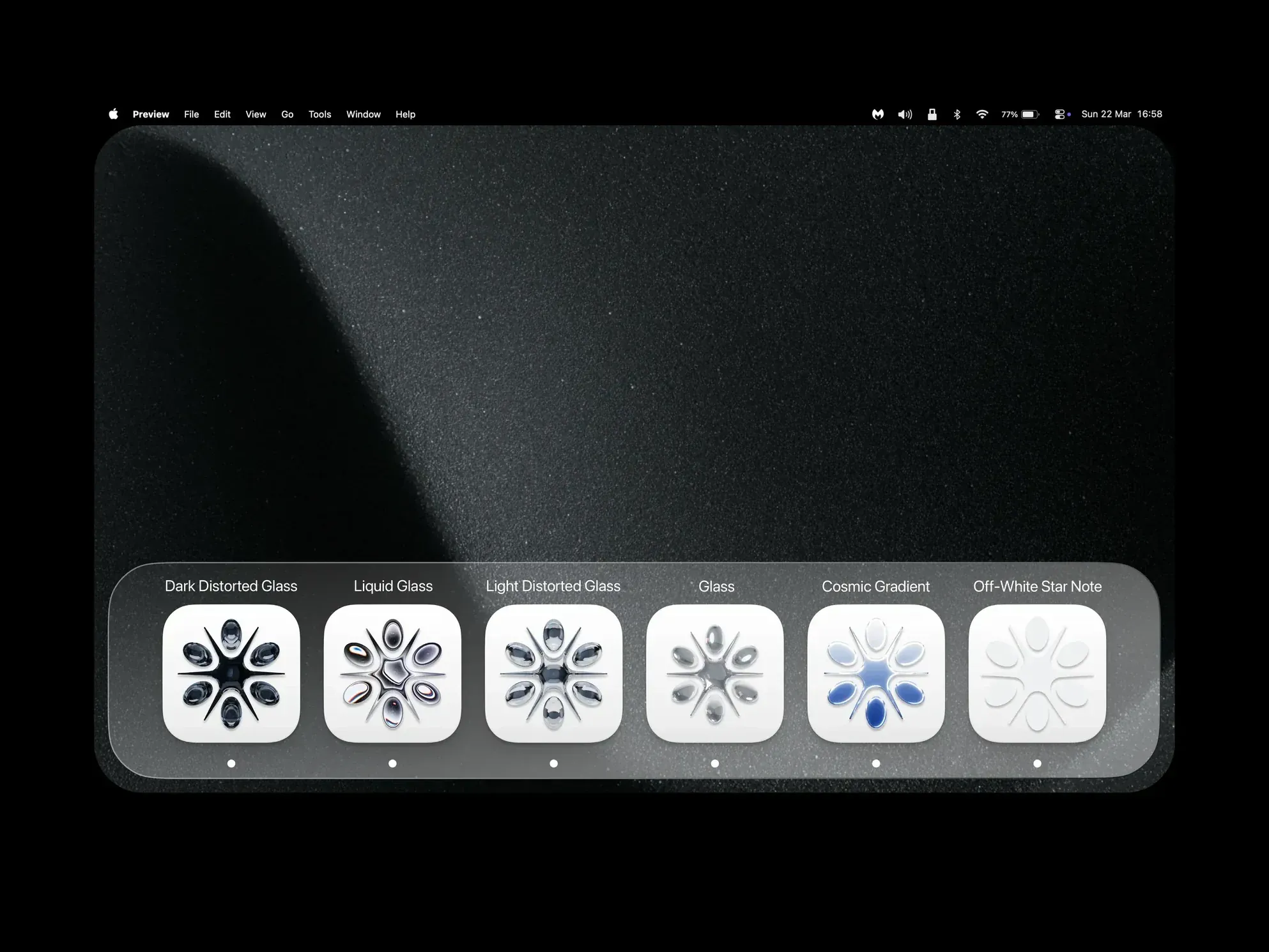
Halftone points & lines spread out from the centre of the mark to echo how sound moves. I also drew a topographic version and six alternative styles for the app icon, from liquid glass to a cosmic gradient.
Built for The Website
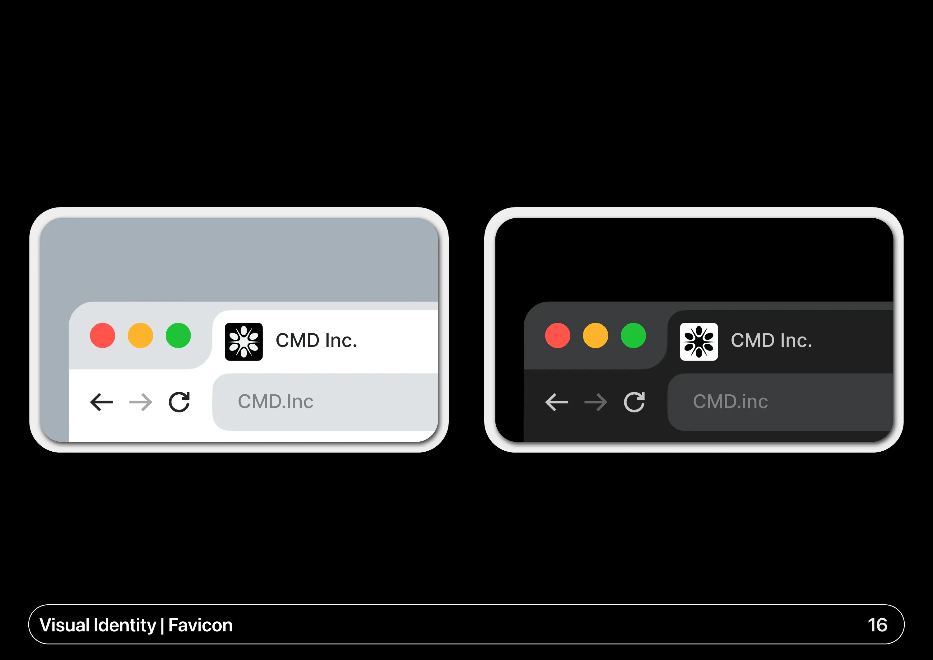
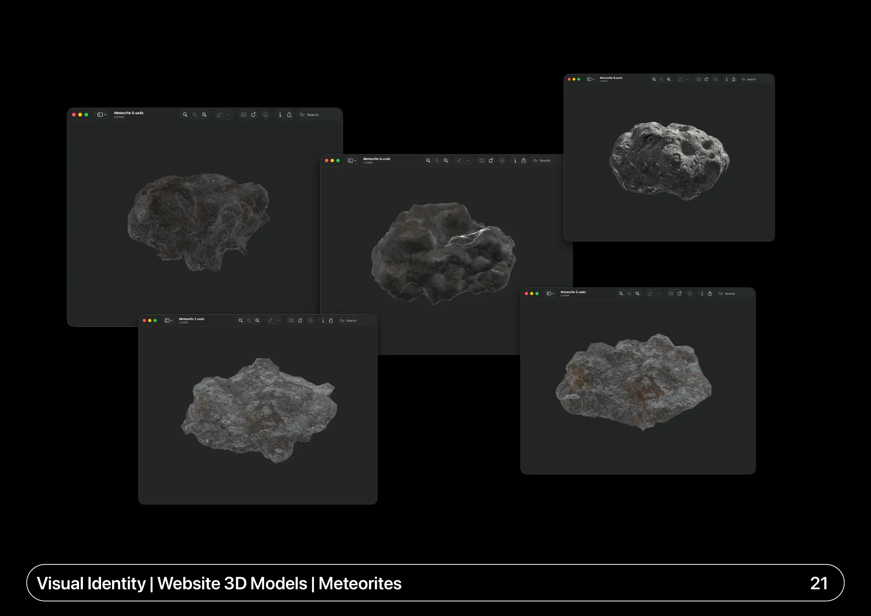
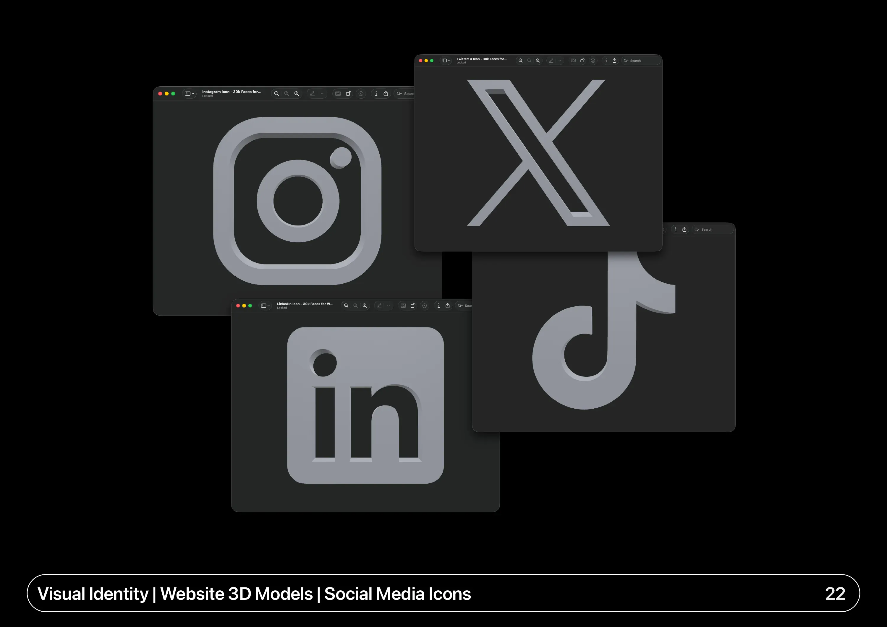
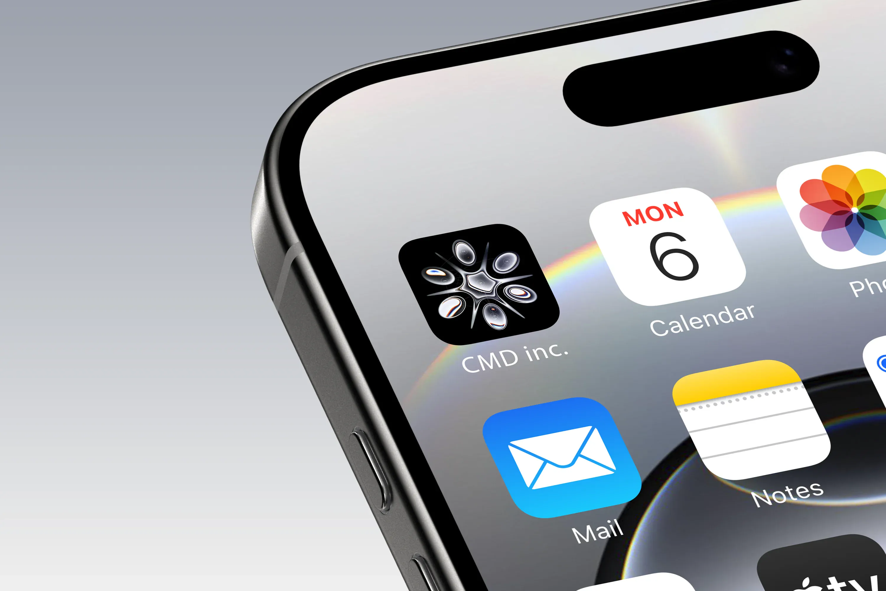
The developer got a logo reveal, favicons, app icons and 3D models of the Star Note, meteorites & social icons. I kept each social icon to 30,000 faces so the site's particle effect stays clean without being heavy, and exported the animations with transparency as .mov for Safari and .webm for every other browser.
Out in The World
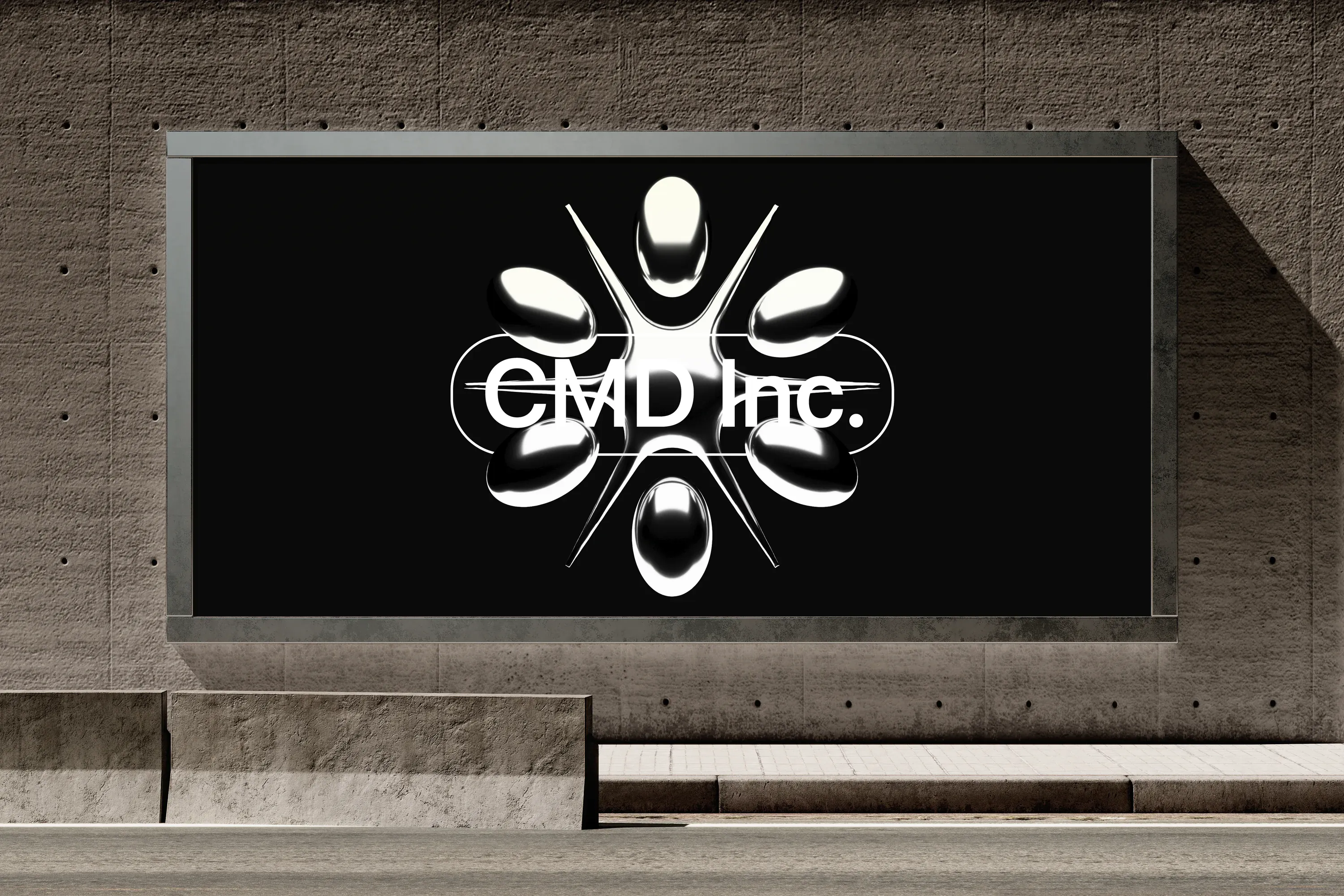
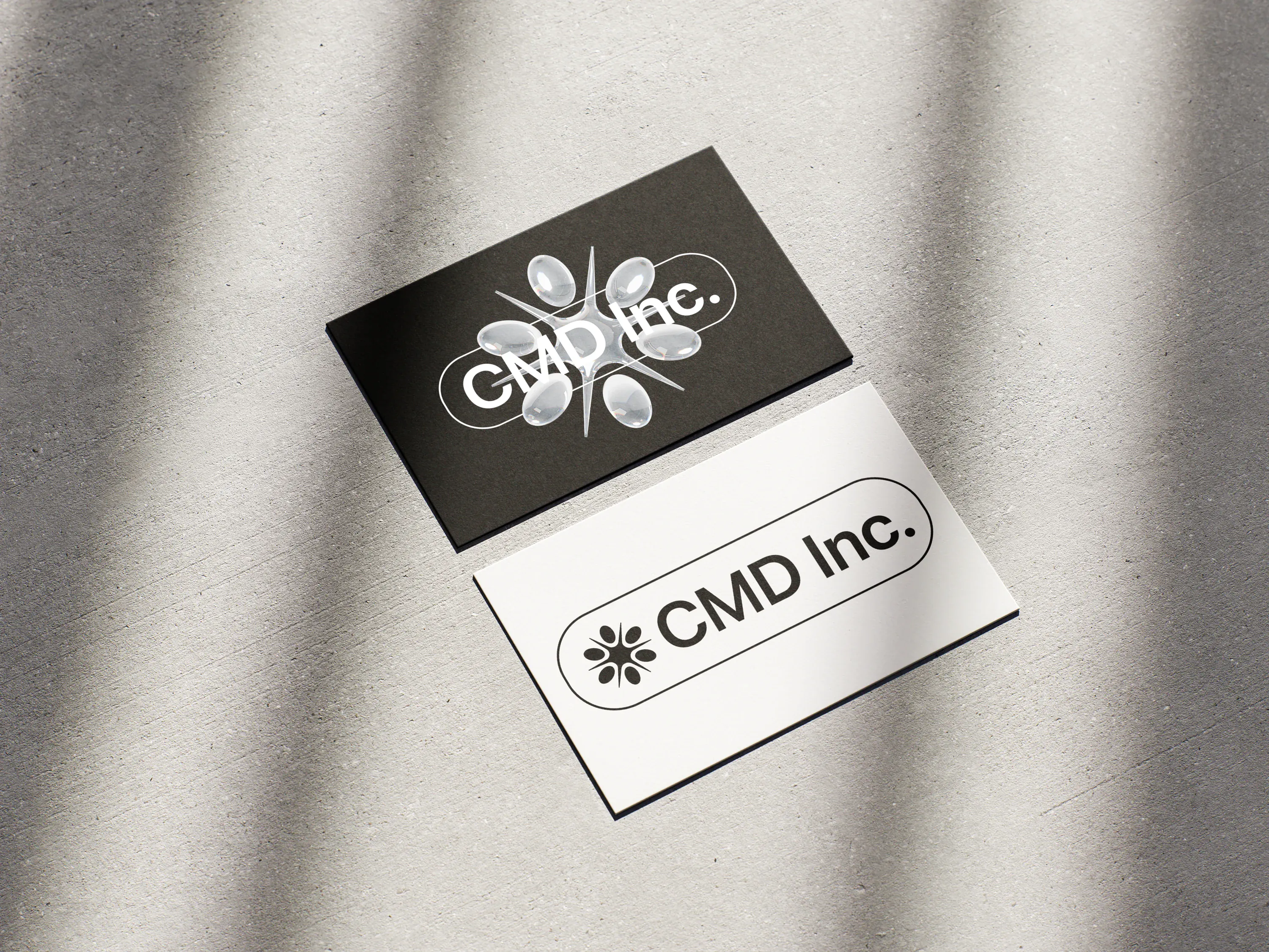
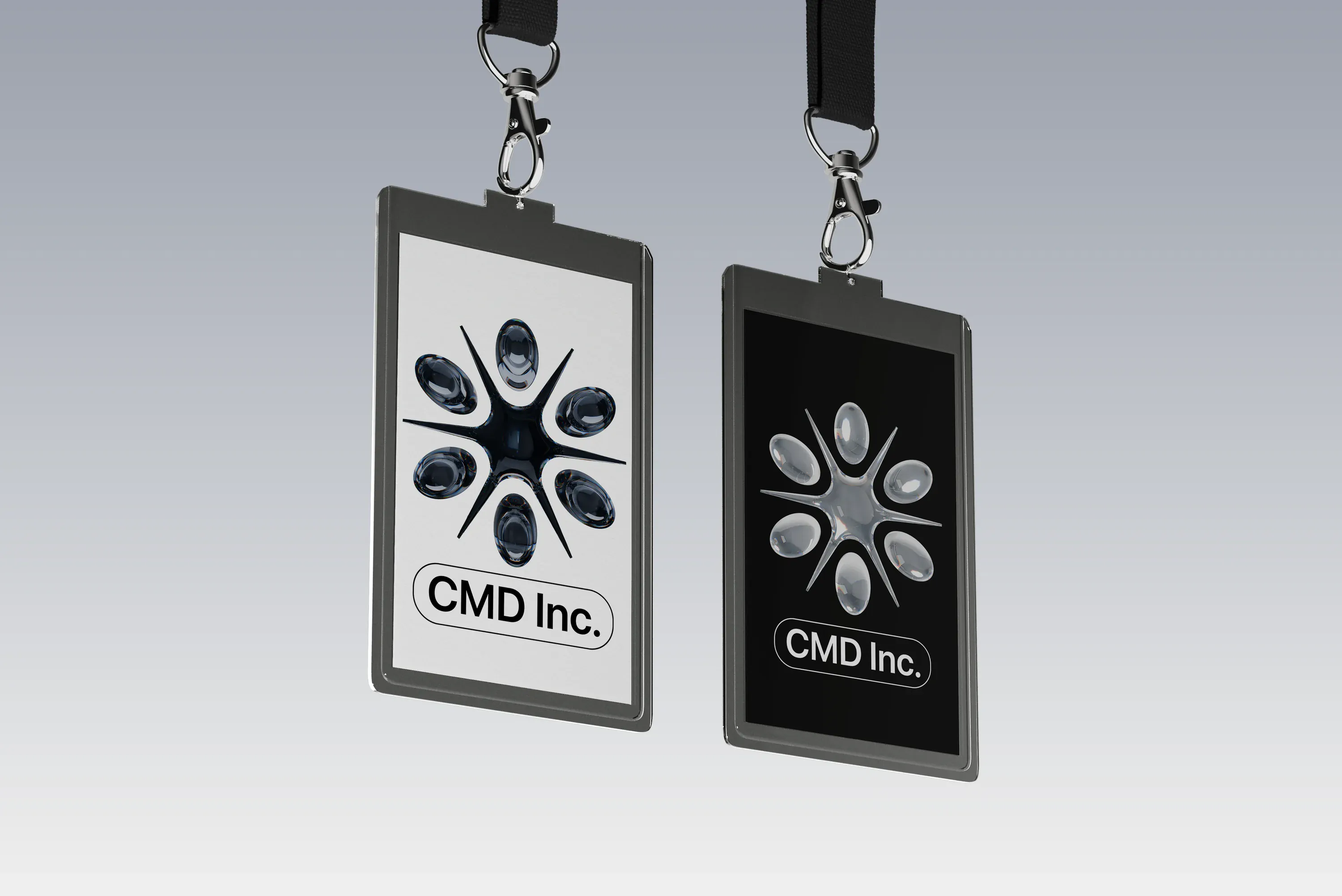
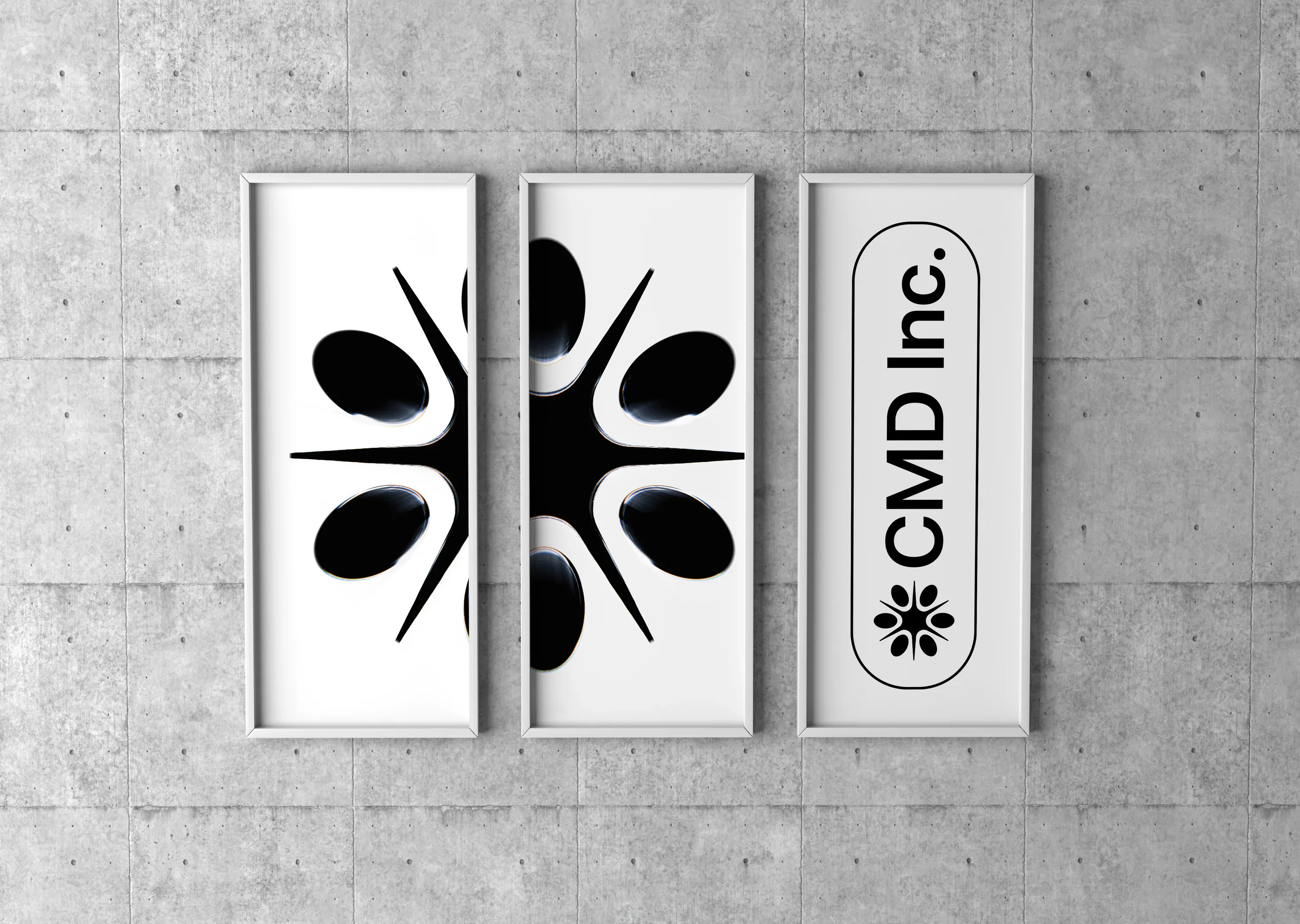
Mockups to check the mark holds up off screen, from business cards to a billboard.
Outcomes
I handed everything over in March 2026. A separate developer is building the website.
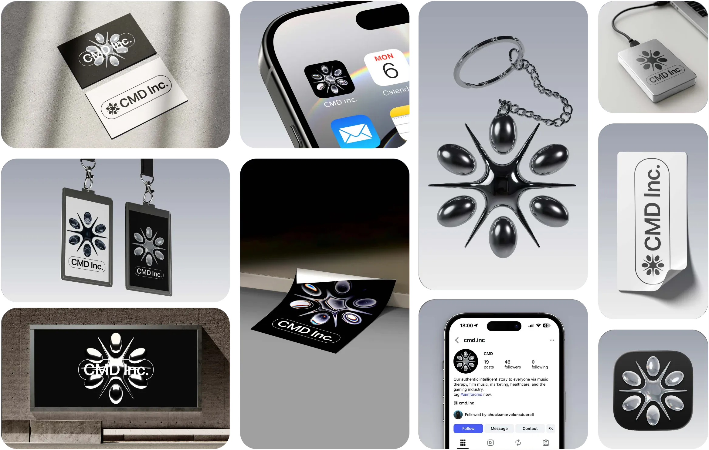
Identity & 3D Assets Handed Over in March 2026
A quietly exceptional creative presence, Conceptual Studio offers more than design. It offers a refined visual language that feels both intentional and deeply human.